Home Depot was founded in 1978 by Bernie Marcus and Arthur Blank, along with Ron Brill and Pat Farrah. The idea came after Marcus and Blank were fired from a home improvement store in Southern California. They wanted to create a home improvement supermarket that offered a wide range of products at competitive prices with a high level of customer service.
To this day, Home Depot remains one of the largest home improvement retailers in the world, with hundreds of thousands of employees and more than 2,000 stores in Us, Mexico and Canada. Its growth continues through new store openings, strategic acquisitions, and continually adapting to retail market evolution and consumer needs.
The Brand
Home Depot is a brand that has been with us for generations. The solutions it offers in the retail market have been pivotal in a market where the demand for DIY solutions has been increasing over the years.
For this reason, i analyzed the graphic brand and some issues related to UX, UI, and some aspects of Digital Marketing, in order to give me an idea of what it currently offers and what it could really offer.
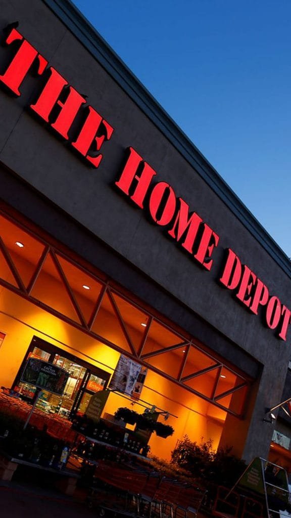
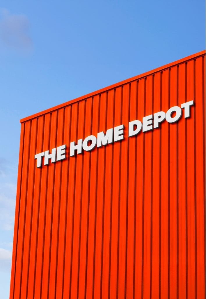
Starting with the logo, although its simplicity and characteristic orange color have served the brand well in terms of visibility and recognition, the design itself lacks a modern narrative that could resonate with new generations of consumers who value innovation, simplicity, and relevance.
Regarding typography, the current Stencil D font, although clear and functional, could be perceived as too generic and very outdated.
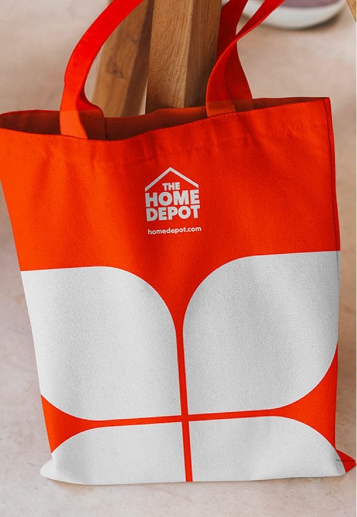
My alternative adds a unique character to the brand without compromising readability. The typography is simple, forgets the angulation, and adds a visible shape for everyone: the home.